
Melissa Armstrong
Data Analyst with Clinical Healthcare Experience
SQL | Excel | Tableau
Exploratory analysis of tourism locations in Myrtle Beach, SC
Analyzed data set for the Myrtle Beach, SC City Planning Department to gain insights on which businesses tourists are most commonly visiting to determine what is drawing tourists to the area and where resources should be allocated.


Analysis of Patient Demographics, Hospital Stay Duration, and Readmittance
Performed in-depth analysis of over 100,000 hospital encounters to explore various factors influencing duration of hospital stay and rate of readmittance. Performed initial analysis of data using SQL. Published Tableau story displaying results.


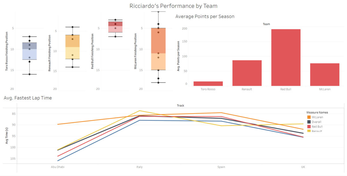
Daniel Ricciardo's Performance by Team in Formula 1
Performed exploratory analysis of 10 years of data on four race tracks to examine how Ricciardo’s performance varied based on Formula 1 team. Visit my Tableau page to interact with the data visualizations!
Analysis of Patient Demographics, Hospital Stay Duration, and Readmittance
Performed in-depth analysis of over 100,000 hospital encounters to explore various factors influencing duration of hospital stay and rate of readmittance. Performed initial analysis of data using SQL. Published Tableau story displaying results.Overview
In the following analysis, we will be exploring the factors relating to longer hospital stays and shorter time periods between discharge and readmittance. This data set provides information on 101,766 hospital encounters between 1999 and 2008. We will use this data to investigate if factors such as patient age or diagnosis correlate to longer hospital stays. We will also look for correlations between various factors and whether the patient was readmitted to the hospital.Data Description & Cleaning
Prior to analysis, it was ensured that there are no null values in the columns of the data set that were used. The top 10 most common primary diagnoses have been renamed from their ICD-9 code in the data set to their full diagnosis name for clarity.Analysis
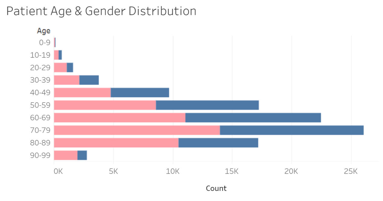
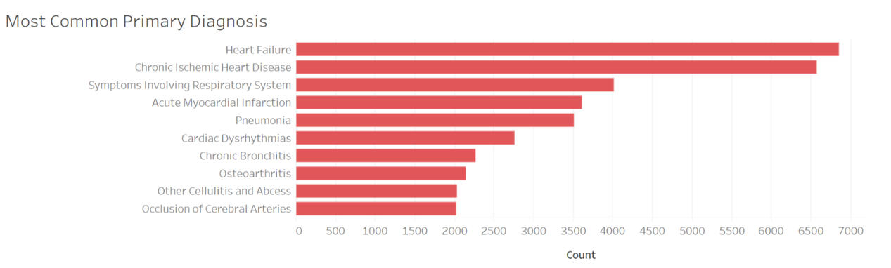
To get a better picture of the patient demographics, I first explored the most common diagnoses, the age and gender distribution, and the most common admission type.
The majority of the patients were female, and the most common age range was 70-79, with a total of 26,068 encounters listed in this group.
The most common admission type was emergency, followed by elective and urgent.
The most common diagnosis code was 428, for heart failure, with 6,862 patients having this listed as their primary diagnosis code. Chronic ischemic heart disease was a close second, with 6,5881 encounters listing this as the primary diagnosis code.
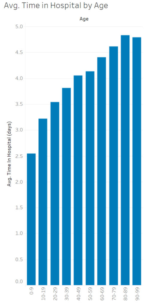
Now let’s focus on our first question: What is the average hospital stay duration by age?
As you can see below, the average length of hospital stay gradually increases as we progress through the age “bins,” with a slight decrease of .038 days in the average occurring between the bins for 80-89 and 90-100.
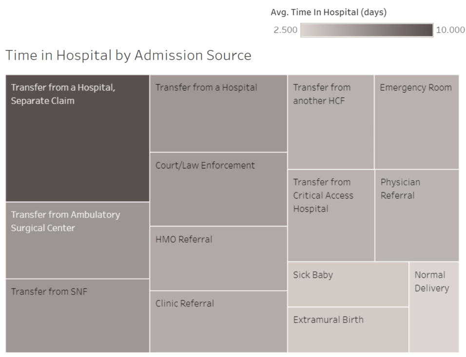
Our next question addresses which admission sources have the longest stays. The treemap helps us compare visit lengths of births, ER transfers, and more. Shown by the size and shade of the block, transfers from other hospitals have the longest stay duration. Normal births have the shortest length of stay.
What factors may influence the rate and time to readmittance?
Next, we’ll take a look at factors correlated to a higher rate of readmittance within 30 days. Some patients are staff favorites, but that doesn’t mean you want to see them as a patient again!What about “frequent flyers”? Let’s take a look at whether patients who had been seen within the last year at an emergency or inpatient care facility were more likely to be readmitted.
As you can see below, patients who had been seen at an inpatient facility or emergency facility were more likely to be readmitted to the hospital. Patients who had been seen at both emergency and inpatient facilities in the past year had the highest rate of readmittance and were readmitted in less than 30 days.


Daniel Ricciardo's Performance by Team in Formula 1
Performed exploratory analysis of 10 years of data on four race tracks to examine how Ricciardo’s performance varied based on Formula 1 team. Full details of analysis and SQL coming soon. Visit my Tableau page to interact with the data visualizations!
Exploratory analysis of tourism locations in Myrtle Beach, SC
The Grand Strand, Dirty Myrtle, Redneck Riviera – Myrtle Beach has many names and many tourists who visit each year. I recently contacted the City Planning department in Myrtle Beach and offered to do a data analysis project. The city planners are interested in investigating what locations have the highest number of tourist visits within 100 miles of Myrtle Beach in order to better understand where to allocate funds. I was provided a data set and asked to perform analysis and data visualization to facilitate easier presentation at a city planning meeting.Let’s take a look at the data set.
This data set has a total of 800 records and includes visitor counts for locations which have been assigned a category group, category, and subcategory to better classify the data. Each record signifies an individual business or attraction and is identified by the unique identifier in the ID column. There are no null values for the columns being used. A second dataset was created to compile a list of the cities which were within 100 miles of Myrtle Beach to filter out irrelevant data. Beach locations were included in the dataset based on parking location and have been grouped into one item in leisure locations.First, we’ll start with determining which category group is the most common for tourists within 100 miles of Myrtle Beach, SC.
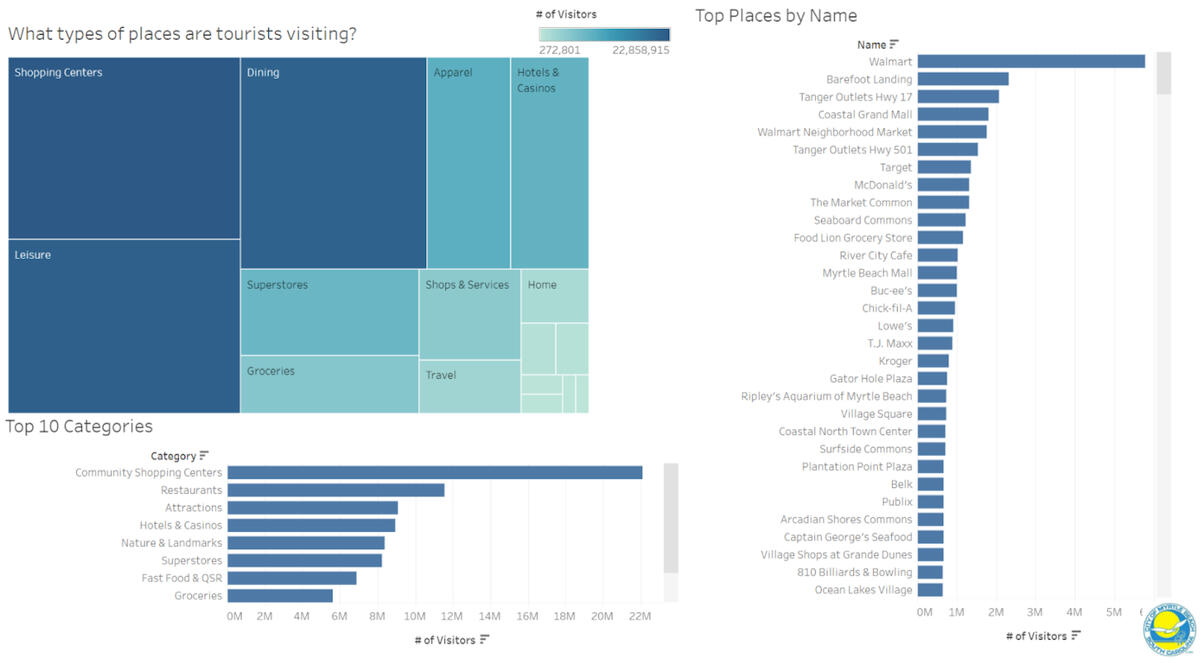
Shopping centers, leisure, and dining are the top 3 category groups. Next, we'll take a closer look at where our tourists are shopping, relaxing, and eating.Shopping Centers:
The top shopping centers are listed below. Airport-related shopping has been excluded at the city planner’s request, as this analysis is focused more on the businesses tourists visit after their travel is completed. Due to the level of specificity in the data, we are unable to examine which businesses within Barefoot Landing and Broadway at the Beach were visited by tourists and are unable to group this into the shopping centers. Instead, we will examine overall tourist visits between the two shopping centers. Broadway at the Beach receives over twice as many tourist visits as Barefoot Landing.


Leisure:
It was no surprise that the beach made the top of the list of leisure locations here. For clarity, a second graph has been added to show an enlarged view of these leisure locations after exclusion of the beach. Ripley's Aquarium tops the list with 731,220 visitors.

Dining:
For presentation purposes, an interactive filter has been added that adjusts the second and third graphs to the subcategory selected in the first graph. To try it out, visit my Tableau page!
Seafood is the most common restaurant type. However, when we look at the average number of visitors per subcategory of dining type, buffets rank higher than seafood restaurants.
Disappointingly, McDonald's is the most popular dining location, with 9 distinct locations included in the data set; however, when fast food locations are excluded to focus more on local establishments, River City Cafe, a local favorite with the best burgers in town, is the top location.


Now that we know where the tourists are visiting, the city planners know where to allocate more resources (and I know which stores to steer clear of during peak tourist season)!